
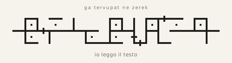
The writing of kudamaf — the pazan — is not a drawn alphabet but a continuous track. Whoever looks at it for the first time does not see a row of separate letters: they see an unbroken horizontal line, with vertical strokes, steps, and dots rising and falling on both sides.
Note
The complete lexicon, a translator from Italian, and a viewer that displays any text in kudamaf can be found in the language application.
The base cell
Each letter occupies a cell of fixed width, crossed at its midpoint by a continuous horizontal line. Above and below that line, the letter arranges its own strokes: vertical bars to the left or right, high or low segments, one or two dots.
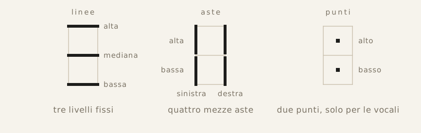
Everything a cell makes available: three horizontal lines, four half-bars at the edges, two positions for the dot. Each letter is a configuration within these possibilities.
There are no uppercase letters or diacritical marks, and nothing is written that is not pronounced. Even punctuation and digits occupy cells like letters, and are described in Punctuation and Digits.
The alphabet
Vowels are recognized by the use of the dot, which consonants never have: the a shows it twice, the e only above, and the u only below.
Consonants are distinguished by which lines they occupy and on which side the bars descend. In the following diagram the light lines around each sign indicate the cell, and are not actually drawn: they serve here only to show where the stroke falls.
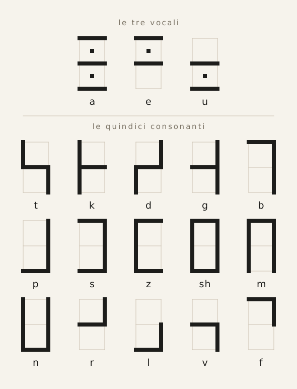
The three vowels and the fifteen consonants. The digraph sh counts as a single consonant and occupies a single cell.
The word-start dash
In pazan the cells follow one another without interruption, and there is no space between words, only a thin dash placed on the first horizontal line of the initial letter.
The elements of the sentence are separated by three small vertical strokes positioned on the first letter of the second, third, and fourth words.
The separator dash
One of the problems of kudamaf calligraphy is that some pairs of letters look identical, since they share the vertical bar located at the boundary between two cells:
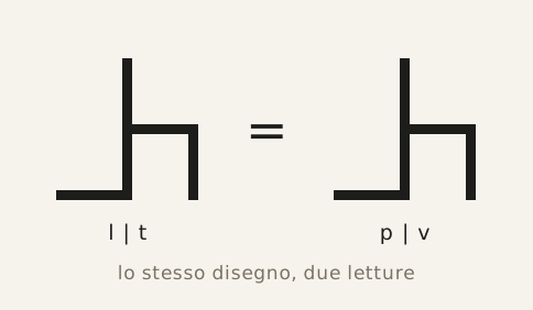
In the previous diagram, the p possesses the entire central vertical bar, while the l has only the lower half and the t only the upper half.
For this reason a dedicated sign is introduced: an oblique dash placed at the junction point between two letters that share the same bar (in the following diagram the dash is shown inside a circle solely to highlight it clearly):
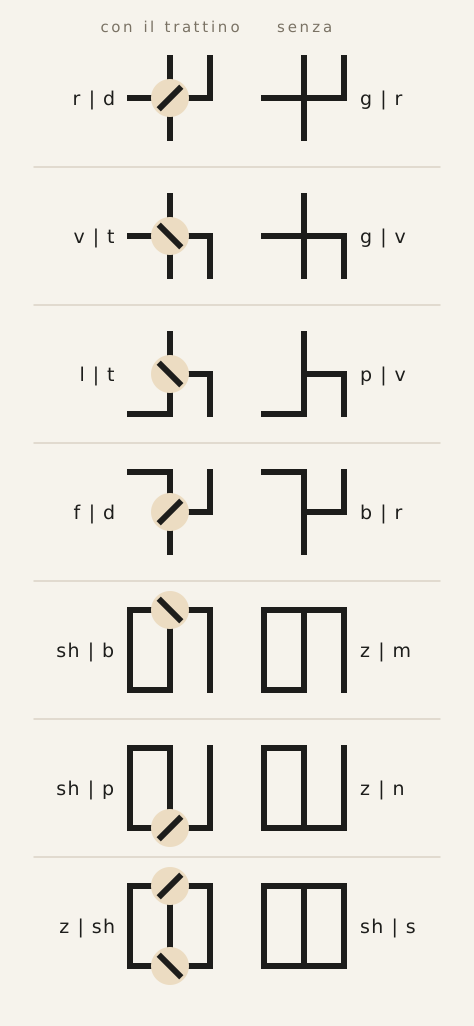
In the case of ambiguities caused by pairs that include the letter sh, the dash is always placed on the latter.
The special case of the pair z-sh, forbidden by the language’s Phonotactics but possible at the boundary between two words, is handled with two oblique dashes.
The line
In the writing of kudamaf every line has the same number of cells; a text, opened to any page, appears as a grid of overlapping rectangles, all of the same length.
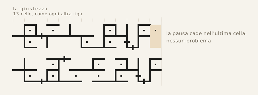
Lines of equal justification (width assigned to the line of text). If a dot falls in the last cell, it causes no problem.
Three reasons are usually given, and they are the same ones heard in the workshops of Theknus regarding any manufactured object: economy, because neither the medium nor the ink is wasted; solidity, because compactness makes writing a continuous, tightly bound structure; architecture, because in Theknus even writing must appear as something built, ordered, and governed by a precise form.
Line wrapping
However, if the justification is rigid, the text must bend. And indeed, when it becomes necessary to break a word in half at the line’s end, a vertical stroke is inserted, a margin bar, at the end of the line. It should be noted that kudamaf does not use hyphenation to split words: each word is a continuous stroke, and the end of the line cuts it wherever it happens to fall.
If instead the word ends exactly at the end of the line, the next one simply begins normally on the following line.
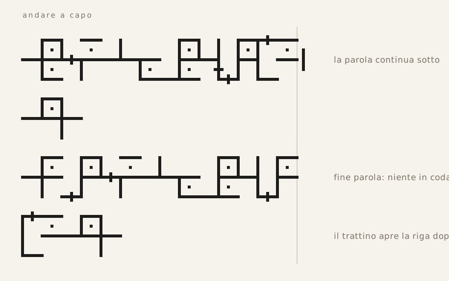
| the word continues below | a vertical bar in the right margin, centered on the midline, as long as one cell’s line |
| the line ends at the word’s end | nothing at the end: the following line opens with the normal word-start dash |
| It is nonetheless possible to start a new line even in the middle of a line, in order to begin a new paragraph. |
Line spacing
Between the band of one line and that of the following line runs half a cell of blank space. The line pitch thus amounts to three half-cells: two for the band of letters, one for the gap.
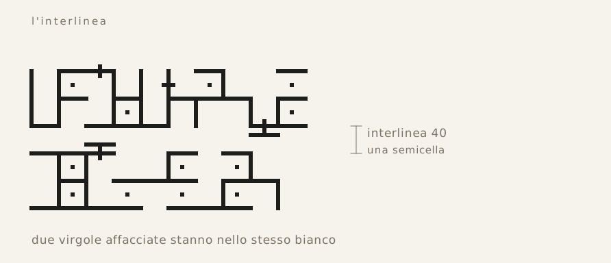
The line pitch. In the blank space between two ribbons, two facing commas also find room.
The digits of the heptimal system are written in kudamaf, in the same cells as the letters, with the addition of the upper and lower line.
Digits
The seven signs
The fundamental glyphs are three. Two, five, and zero, which arises from the union of the two. The other four digits are obtained from these with a suspended dash: below it means minus one, above it means plus one. Two and five both have the upper and lower lines, to prevent the numbers from being confused with ordinary letters.
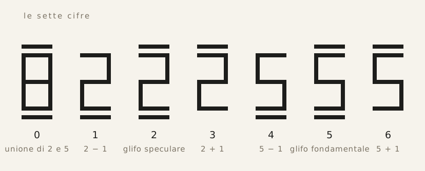
The seven digits. The three pure glyphs carry both dashes; the other four carry only one.
The symbolic value of the three signs — the mirrored pair and their union — is described in Number System.
The dash and the comma
The dash runs at the same height as the comma, just outside the band, and is one cell long like it. The difference lies entirely in the attachment: the comma hangs from a short bar descending from the edge of the ribbon, while the numeric dash is suspended, with nothing connecting it to the letters.
Hence the reading rule: if the fourth line is attached to the letter cells, it is a comma; if it is suspended, it is a digit. For the same reason, a number never takes the word-start dash, which would make it resemble a comma. Thus there is no separator between the number and the words surrounding it: the number ends where its digits end.
Multi-digit numbers
Digits are written one per cell, starting from the most significant, with positional notation in base 7.
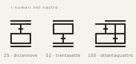
*Three notable numbers of Solarian culture: nineteen, thirty-seven, and eighty-four.
The punctuation of kudamaf is reduced to two signs: the pause cell, which closes the sentence, and the comma, which opens a subordinate clause. Nothing else exists. There are no quotation marks, asterisks, parentheses, dashes, semicolons; there is no sign for direct speech nor one for quotation. Everything that in earthly writing systems is entrusted to a forest of signs is here entrusted to syntax or lexicon.
Punctuation
The pause cell
The pause cell is a cell devoid of horizontal lines. For this reason it cannot be confused with a letter, since every letter contains at least one horizontal line.
The pause cell can take different forms depending on its function:
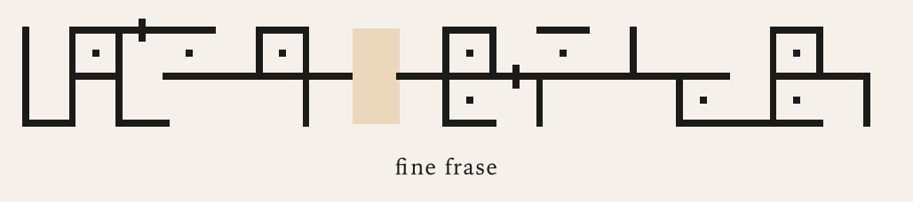 The end of the sentence, i.e. the period, is indicated by an empty cell
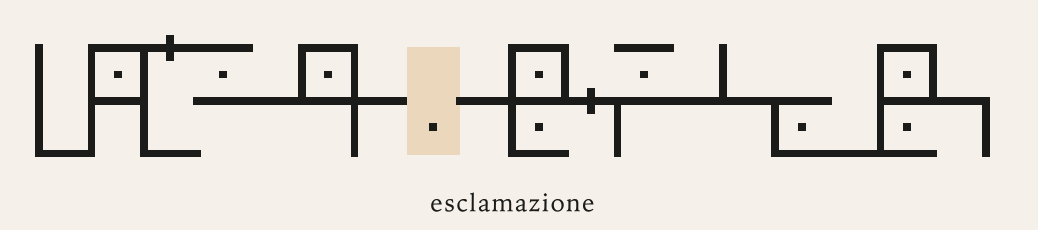 The exclamation point is indicated by a dot below, as in the u
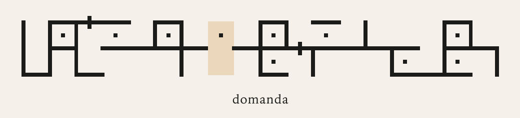 The question mark is indicated by a dot above, as in the e
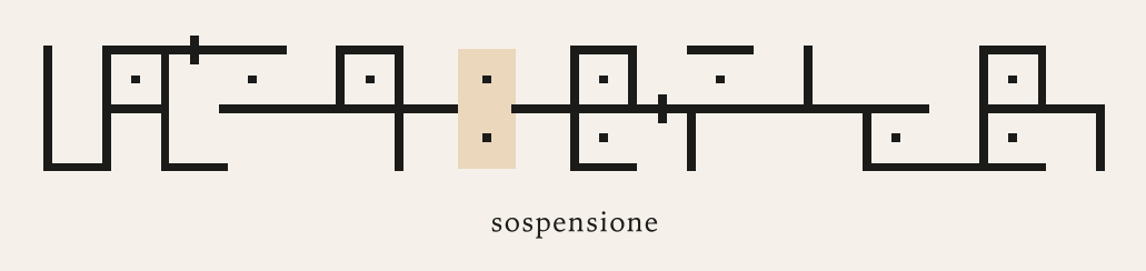 The ellipsis is indicated by two dots, as in the a
The dots used to distinguish question, exclamation, and suspension are thus borrowed from the vowels.
The pause occupies a cell, like all letters, and can occupy any position in the line, including the last one.
The comma
The comma introduces a sign external to the letter cell. It marks the entrance into a subordinate clause and is drawn as a small dash placed just above or below, joined to a short bar extending from the edge of the cell.
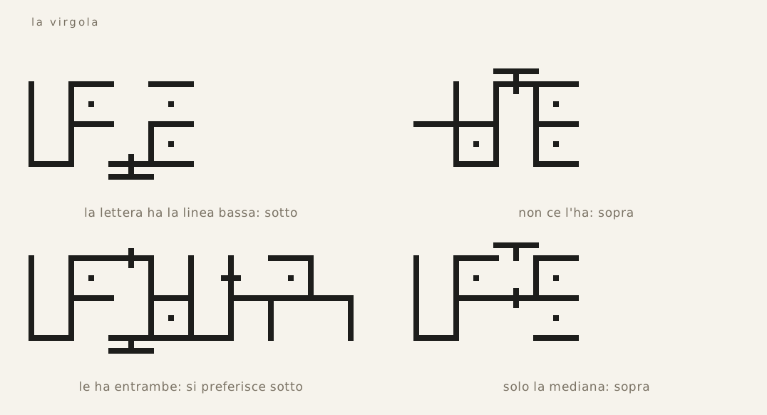
The side on which the comma develops is dictated solely by the letter it rests on: below if that letter has the low line, above if it does not.
The comma is always found at the beginning of a word, so at times the two signs merge, as in the first two examples of the previous diagram.
Direct speech and quotation
Direct speech does not use any special signs, because it does not need them. It is introduced by a verb of saying, and the comma is enough to separate it from the rest of the sentence. For example: Luca said, tomorrow I leave.
Quotations, too, do not use quotation marks. When one wishes to quote a word, a name, a title, or a sentence, it is stated directly in the text. For example: the word house, the name Marco, the title The Tartar Steppe, the sentence tomorrow I leave.
The inhabitants of Theknus thus avoid ambiguity by relying on words, rather than on graphic signs such as quotation marks.